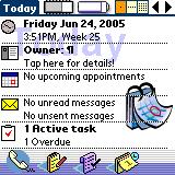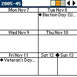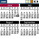


The above screenshots are from Today v2.2, which is a very Windows CE / Pocket PC kind of application. It's a powerful application which can work as your primary interface to the built-in PIM. The first screenshot above is the opening screen and while it's not busy, there are a number of options available.
Screenshot Explanation:
- Top Row: Just to the right of the word Today is the amount of internal memory and to the right of that is the battery meter. The next item on the top row is the .|..|:: (Day/Week/Months) selector which switches between the three screens shown here. The left and right arrows move backward and forward through the data by day, week or month (depending on what screen you're on).
- Clock Icon: Displays the date and time. This launches the Date & Time Preference screen.
- Owner: This launches the Owner Preference screen.
- Calendar: Displays today's appointments. This launches the calendar application.
- eMail: Displays unread emails here. This launches the email application.
- Tasks: Displays active tasks. This launches the Tasks application.
- Bottom Row: The launcher on the bottom row launches the Contacts, Memo, Tasks and Calendar applications.
Note: This article was originally posted to the TreoVida blog on date listed. It was moved to Does the fun ever start ? on Sunday, October 23, 2005.
1 comment:
At Monday, June 27, 2005 10:04:11 AM, yfml said...
Non-related to Freeware - but just a comment . On my office computer , the right side of your page is still blank and the info is at the bottom of the page. At home, it is on the right side of the page like is used to be. Wonder why that is ? The office computer layout changed when you said you "redesigned" it.
Post a Comment